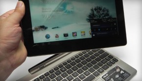
Optimize For Travel Season: Blog In An IPad-Friendly Way
Is it just me, or do we have to make adjustments constantly to our blogs to keep up with changing technology? One minutes I am finishing up an update to make it compatible with certain helpful apps, and the next I am having to redo the format to allow for mobile navigation. While I can understand the need, it drives me crazy.
The latest necessity for these changes is the iPad. Apple’s signature tablet has replaced computers for many users that swear by the lightweight, highly functional device. They watch movies, communicate and – yes – read blogs on it. Which means you have to make sure your own blog is friendly for iPad use…a whole different type of mobile compatibility.
One of the most common complaints I hear is that images aren’t syncing up with the proper text, or the navigation is off in some way. Luckily, it is a simple enough problem to work out, no matter what platform you are using.
The Importance of RSS Feeds

Most iPad users are going to be using RSS feeds to view and manage content. The entire screen display was just made for that kind of use. Not only that, but they usually use a platform that gathers and organizes RSS feeds into an easily read format, such as Pulse or Feeddler.
If you don’t have full RSS enabled on your blog, then only a small portion of your posts are going to be correctly displayed on the iPad screen. The rest will be jumbled, and images may very well show up incorrectly. So make sure you have no character limits on what will be shown. This will also help with mobile viewing for many people.
Social Media Buttons

Every blogging tip article you have ever read has probably stressed the need for the buttons to share content on social media. Which is a great tip and one that every blogger should follow, as many people don’t like copy-pasting links onto their feed.
But with your RSS feed, you should probably forgo the buttons. It might be against your natural inclination, but most readers that the iPad uses will already have those buttons built in. So your own will just screw with the format and look bulky and awkward.
Flash Is Not Flashy

Apple products do not support Flash. So any content that you have in that coding will appear broken and possibly ruin the rest of the post’s formatting. Not only does this make it hard to read, but it is unprofessional looking. No one wants that.
Same goes for fixed-positioning codes you have done in CSS; a likely scenario for WordPress users. It will break up the formatting at those points, and make it hard to read.
Utilize Grids

One of the easiest ways to allow for browsing on any device is by creating a grid based layout. This is referred tp as responsive web design, and it will stretch or shrink your layout to fit whatever device it senses your reader is using.
Of course, this means you will have to redesign your layout, which might not seem easier. But when you think of the work involved with adjusting your RSS feed, it might be a simpler all-in-one solution.
Conclusion
It is important in today’s world to make sure your website is available on all devices, and not just a few. Tablets are popular, especially the iPad. So make sure you are letting your blog be seen, no matter what the screen size.
About the Author: Jessy is the on-the-go blogger for Dobovo, Ukrainian travel tool
License: Creative Commons image source
License: Creative Commons image source
License: Creative Commons image source
License: Creative Commons image source


